WMBA 6401 is Human Resource Analytics, three semester credits, and Walden's catalog places WMBA 6201 ahead of it. The graded work asks you to turn workforce data into measures an organization could be run on: define the figure precisely, tie it to a goal the business has actually stated, read it without overclaiming, and finish on an action somebody owns. Definitions, not statistics, are where most of the marks move.
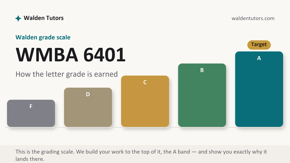
What WMBA 6401 actually grades
Walden describes this course as an examination of HR analytics and metrics used to improve performance at both the individual and the organizational level, feeding recruitment, talent development and retention, and tying what the HR function does back to what the business is trying to achieve. The catalog also puts human resource information systems in scope, along with the working relationships between HR and its internal partners in technology, finance and the executive suite. On paper that becomes analytical writing built on numbers rather than opinions.
The graded artifacts tend to fall into four families. There are metric proposals, where you argue that a particular measure deserves a place in the reporting pack. There are dashboard exercises, where the grading turns as much on what you left out as on what you included. There are diagnostic analyses, where a pattern in the data has to be explained and then acted on. And there are graded discussion threads running alongside all of it, scored on their own rows.
Across those families the rubric keeps asking the same four things. Is the measure defined precisely enough that two analysts would compute it identically? Does the measure connect to something the business has said it wants, rather than to something the system happens to record? Is the interpretation supported by the figure, or has a modest movement been dressed up as a trend? And does the piece end somewhere a manager could act? Course-Based grades are letter grades assembled from those rows, so a fluent paper that answers three of the four still surrenders the fourth.
The measures this course keeps returning to
You will meet a recurring cast of figures, and the fastest way to sound competent is to define each one in your own words before you use it. Time to fill and time to hire are not the same measure and are routinely confused. Cost per hire depends entirely on which costs you agreed to count. Turnover splits into voluntary and involuntary, and a paper that reports a single blended figure has thrown away the part that matters. Quality of hire is a composite somebody has to design, which makes it the best question in the course and the worst one to answer vaguely. Absence, internal mobility, promotion rate, span of control, revenue per employee and training participation all show up somewhere.
For each of them, write the numerator, the denominator and the time window before you write anything else. That habit sounds pedantic until you notice how many rubric rows it quietly satisfies at once, and how often a classmate's post falls apart because nobody agreed on which population was in the bottom of the fraction.
How we help in this course
Send the assignment page, the scoring guide as your classroom displays it, and a short note on the organization you want to write about, including whatever real figures you are allowed to share. Rough numbers are fine and so is a frank statement that you have none. What comes back is an analytics piece with every measure defined before it is used, the interpretation held to what the figures support, and a closing recommendation that names an owner and a date.
Terms are the same across this site. Work lands in 24 to 48 hours, drafting targets an A row by row, one reviewer scores the draft the way faculty will while a second checks APA and originality independently, and revision continues until the target is reached.
Weekly manuals for this course
Nothing week-specific is published for this course yet. Walden keeps syllabi inside the classroom, which means an honest week manual can only appear after students in the section confirm what the deliverable actually was, and we are not going to guess a grid and call it published. When the item in front of you is not covered, drop its instructions into chat and the desk builds from what your section actually posted. Drafting has never been gated on the manual layer.
In WMBA 6401 right now?
Send the brief, the rubric and any numbers you can share. The first premium sample is free and returns inside two days.
Pacing an analytics assignment inside a semester term
The MBA sits on Walden's semester calendar, not the shorter quarter terms nursing students talk about, and the published spans bear that out. Fall Semester 2026 is listed as September 7 through December 27, a stretch of 111 days, and the Spring and Summer 2026 semesters are each given that same 111. Divide it out and you land just under sixteen weeks. Walden's calendar page prints dates and leaves the week count unstated, so that sixteen is a number you derived rather than one the university published, and your own program calendar governs the term you are sitting in.
Length is not the same as slack, though, and analytics assignments punish late starts harder than essays do. The work has a data step in front of the writing step, and the data step is the one that surprises people: the report you assumed existed does not, the figure covers the wrong period, or the two systems disagree about headcount. Give yourself a day between deciding on your measure and drafting the analysis. The cutoff is 10:59 p.m. Central, printed elsewhere as 11:59 p.m. Eastern, and week one carries an obligation of its own, since Walden wants a posted assignment or discussion from you inside it.
The count of graded items is a section-level fact, and no page outside your classroom can supply it. Walden says openly that requirements differ between courses and shift from one week to the next inside a single course, which makes a classmate's recollection of last term worthless as a planning input. Tally your own syllabus.
How to actually write WMBA 6401: where to begin
Open the scoring guide before you open a spreadsheet. In the Walden classroom the rubric hangs on the graded item, so you can read the grader's questions before writing a word. Paste the rows into a blank file, turn each one into a heading, and write its weight in the margin beside it. Those weights are a word budget, and analytics students blow it the same way every term: three paragraphs on how the data was pulled, one thin paragraph on what it means.
Next, choose a question rather than a dataset. The weakest submissions in this course start from whatever numbers were available and then hunt for something to say about them. The strong ones start from a decision somebody has to make. Should we keep paying an agency for warehouse hiring? Is our supervisor training changing anything we can see? Why do the two branches with identical pay bands have different exit rates? A question of that shape tells you which measure you need, which comparison makes it meaningful, and when you are finished.
Then write the operational definition, and write it out fully even if it feels obvious. State the numerator, state the denominator, state the window, and state the exclusions. Are internal transfers counted as hires? Do seasonal staff sit inside the turnover base? Does a fixed-term contract ending count as voluntary? Two analysts using the same payroll extract can produce turnover figures several points apart purely by disagreeing on those questions, which is precisely why the row exists on the rubric.
Now build the comparison, because a lone number cannot be interpreted. A rate means something against last year, against another site, against a published benchmark, or against a target the organization set for itself. Say which comparison you are using and why it is fair. If you are benchmarking against an industry figure, name the source and check that its definition matches yours, since borrowed benchmarks computed on a different denominator are worse than no benchmark at all.
Interpret with more restraint than feels natural. This is the row where confident writers lose points, because the sentence that says the new onboarding program reduced turnover is a causal claim and the data almost never supports one. Write what the figures show, name the alternative explanations, and say what evidence would separate them. A paragraph that lists three plausible causes and proposes a way to test between them scores higher than a paragraph that picks one and asserts it. Small movements deserve the same discipline. A two-point shift on a base of forty people is a handful of individuals, and saying so out loud reads as competence rather than hedging.
Design any dashboard around its audience. Ask who reads it, what decision they own, and how often they can act, then include only measures that pass all three tests. Give each one a definition, a direction that counts as good, and a comparison point. Executive views stay short and tie to stated business goals. Manager views carry the operational figures that person controls. Aggregate anything small enough to identify a person, and say in the paper that you did.
Handle the data ethics explicitly, because HR analytics touches employment decisions and pay. Say what would be anonymized, what would be aggregated, who would hold access, and where a measure could disadvantage a group without anyone intending it. Selecting on a proxy that tracks age or disability is a real risk and naming it earns the row that generic writing walks past.
Source through the Walden Library, not a browser tab. The business and HR databases the rubric assumes are behind that login, and the librarians will retrieve a metrics validation study faster than you will find one loose on the web. Consultancy reports have a place as industry context, but they do not substitute for peer reviewed work when the row says scholarly. Give every source one job you could name in half a dozen words, and make your paragraphs put sources in conversation with each other and with your own figures rather than stacking summaries. APA 7 runs the whole document: every in-text citation should find its reference, every reference should find its citation, and nothing should be sitting on one side alone. Tables and figures follow the APA format rules too, with a number, a title and a note, and the body text has to say what the reader should notice in each one.
| Section | What it does | Where it usually fails |
|---|---|---|
| Business question | States the decision the analysis exists to inform, and who has to make it. | Opening with the data that was available instead of the choice it should affect. |
| Measure definition | Gives the numerator, denominator, time window and exclusions for every figure used. | Naming a familiar metric and assuming the reader shares your version of it. |
| Data and method | Says where the figures came from, what was cleaned, and what the limits are. | A method section longer than the findings, describing software instead of decisions. |
| Findings | Presents the numbers with their comparison point, in a table or figure the text explains. | Charts dropped in with no sentence telling the reader what to look at. |
| Interpretation | Explains what the pattern could mean and which rival explanations remain open. | A correlation reported as a cause, usually in the sentence the writer liked best. |
| Recommendation | One action, an owner, a start date, and the figure that will judge it later. | Advice to monitor the situation, which no rubric row can score as actionable. |
Discussion posts that hold up under a rubric
Threads here are graded work with rows of their own, and they usually hand you a metric, a dashboard or a scenario and ask what you would do with it. Treat the opening post as a compressed brief: your position first, the measure defined in one clause, the figure or the reading that supports it, and a closing line your classmates can push against. Attach a citation to the post itself. A row scoring evidence has nothing to award an argument that arrives without any.
Spread your presence across the week rather than emptying it in one evening. The published grading policy wants substance, regularity and punctuality from your participation, and it names a floor for the regularity part: two to four separate days in the week, minimum. Replies carry their own score, and agreement earns nothing. Do something to the argument in front of you: ask what behavior a classmate's metric would produce if people optimized for it, point out that their denominator excludes the group causing the problem, or supply the confounder their causal reading skipped. Reply quotas and closing times are set inside the section, so the week's own instructions are the only place worth checking for either.
The mistakes that cost points in WMBA 6401
- A rate quoted with no denominator and no period, so nobody can tell whether it is large.
- Voluntary and involuntary exits blended into one turnover figure that hides the finding.
- Causal language attached to a comparison that could not possibly establish cause.
- A dashboard built from everything the HRIS exports rather than from what a named reader can act on.
- Benchmarks borrowed from a report that computes the measure differently, with the mismatch never checked.
- Employee-level detail left visible in an appendix that should have been aggregated.
- Vendor white papers and consultancy posts doing work the row reserved for peer reviewed HR research.
WMBA 6401 questions students actually ask
What if I cannot get real HR data from my employer?
Build the measure anyway and populate it with figures you label as illustrative. The rubric rows in an analytics course reward the definition, the logic and the decision far more than they reward access to a payroll system, and a clearly flagged worked example loses nothing. Write the operational definition in full, state where the number would come from in a real system, then show the arithmetic on numbers you have invented and said so. What you must not do is present estimated figures as though they were pulled from a live report. That is a research integrity problem, not a shortcut.
How much statistics does this course expect?
Less than students fear, and more care than they expect. Most graded work in an HR metrics course sits on counts, rates, ratios, averages and comparisons across time or across groups. A correlation or a simple regression may appear where the week calls for it, but nobody is grading you on advanced modeling. What does get graded is whether you know the difference between a change and a meaningful change, whether your denominator is the right population, and whether you resist reading cause into two lines that happen to move together.
What belongs on an HR dashboard and what does not?
A metric belongs on the dashboard if somebody at that level can act on it within the reporting cycle. Everything else is a report, not a dashboard. Match the audience to the altitude: an executive view carries a handful of measures tied to stated business goals, while a line manager view carries the operational figures that person controls, such as open requisitions, time to fill and absence in their own team. Leave off anything that would identify an individual employee, and leave off metrics you collect only because the system produces them.